PROJECT
Magic System
WORK CATEGORY
Logo + 3D
CLIENT
Magic System
PROJECT DETAILS
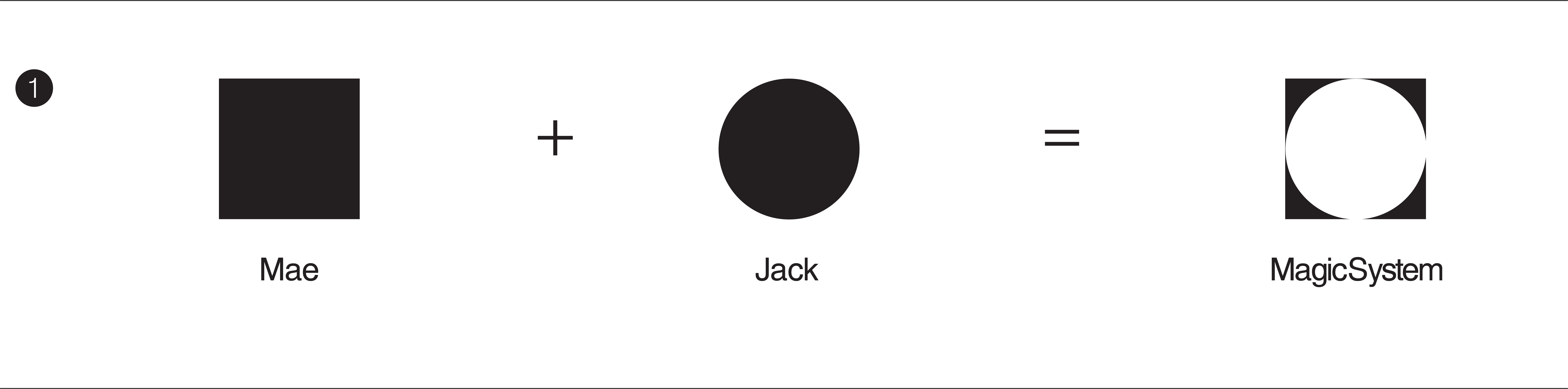
Comissioned by Magic System, a Singapore-based strategic creative agency. In [1], the logo was designed to convey the idea that the 2 distinct entities that make up the company, Mae and Jack, fit seamlessly together within a shared space. This concept is represented through the use of two distinct shapes, a square and a circle, both are of different parameters but at some point of intersection, a circle can fit perfectly in a square and vice-versa. In [2], a crescent shape was carved out from the negative space of the circle, representing the brainchild of Mae & Jack, as it emerged out to form the arm of Magic System.